The Widgetkit Media Player is a HTML5 audio and video player completely built HTML and CSS. You can easily embed video files into your website by using the HTML5 video element. A Flash player fallback is included for all unsupported browsers.
Examples
This is a MP3 Audio Sample:
Features
Native playback for modern HTML5 browsers
Supports MP4 (h.264), WebM, FLV, WMV and MP3 files
Completely built with HTML and CSS
Responsive design to fit all device resolutions
Same UI in all browsers
Create your own skins
Flash player fallback for unsupported browsers
Works with Joomla and WordPress
How To Use
Use the HTML5 video element to embed video in your website. For example:
Use the HTML5 custom data attribute data-lightbox to activate the lightbox. You can set various lightbox parameters to the data attribute. For example:
The Widgetkit Spotlight allows you to add an overlay to your images which fades or moves in on mouse hover. The overlay can be an image or HTML content. The default magnifier spotlight is a perfect match to be used with a lightbox.
Examples
If no custom overlay is set the default spotlight fades in an overlay with an magnifier image. If you define a custom overlay you can choose between different animations - fade, bottom, top, right and left.
Plugins can be included individually (though some have required dependencies), or all at once. Both bootstrap.js and bootstrap.min.js contain all plugins in a single file.
Data attributes
You can use all Bootstrap plugins purely through the markup API without writing a single line of JavaScript. This is Bootstrap's first class API and should be your first consideration when using a plugin.
That said, in some situations it may be desirable to turn this functionality off. Therefore, we also provide the ability to disable the data attribute API by unbinding all events on the body namespaced with `'data-api'`. This looks like this:
$('body').off('.data-api')
Alternatively, to target a specific plugin, just include the plugin's name as a namespace along with the data-api namespace like this:
$('body').off('.alert.data-api')
Programmatic API
We also believe you should be able to use all Bootstrap plugins purely through the JavaScript API. All public APIs are single, chainable methods, and return the collection acted upon.
$(".btn.danger").button("toggle").addClass("fat")
All methods should accept an optional options object, a string which targets a particular method, or nothing (which initiates a plugin with default behavior):
$("#myModal").modal()                       // initialized with defaults
$("#myModal").modal({ keyboard: false })   // initialized with no keyboard
$("#myModal").modal('show')                // initializes and invokes show immediately
Each plugin also exposes its raw constructor on a `Constructor` property: $.fn.popover.Constructor. If you'd like to get a particular plugin instance, retrieve it directly from an element: $('[rel=popover]').data('popover').
No Conflict
Sometimes it is necessary to use Bootstrap plugins with other UI frameworks. In these circumstances, namespace collisions can occasionally occur. If this happens, you may call .noConflict on the plugin you wish to revert the value of.
var bootstrapButton = $.fn.button.noConflict() // return $.fn.button to previously assigned value
$.fn.bootstrapBtn = bootstrapButton            // give $().bootstrapBtn the bootstrap functionality
Events
Bootstrap provides custom events for most plugin's unique actions. Generally, these come in an infinitive and past participle form - where the infinitive (ex. show) is triggered at the start of an event, and its past participle form (ex. shown) is trigger on the completion of an action.
All infinitive events provide preventDefault functionality. This provides the ability to stop the execution of an action before it starts.
$('#myModal').on('show', function (e) {
    if (!data) return e.preventDefault() // stops modal from being shown
})
Transitions bootstrap-transition.js
About transitions
For simple transition effects, include bootstrap-transition.js once alongside the other JS files. If you're using the compiled (or minified) bootstrap.js, there is no need to include this—it's already there.
Use cases
A few examples of the transition plugin:
Sliding or fading in modals
Fading out tabs
Fading out alerts
Sliding carousel panes
Modals bootstrap-modal.js
Examples
Modals are streamlined, but flexible, dialog prompts with the minimum required functionality and smart defaults.
Static example
A rendered modal with header, body, and set of actions in the footer.
Toggle a modal via JavaScript by clicking the button below. It will slide down and fade in from the top of the page.
Modal Heading
Text in a modal
Duis mollis, est non commodo luctus, nisi erat porttitor ligula, eget lacinia odio sem.
Overflowing text to show optional scrollbar
We set a fixed max-height on the .modal-body. Watch it overflow with all this extra lorem ipsum text we've included.
Cras mattis consectetur purus sit amet fermentum. Cras justo odio, dapibus ac facilisis in, egestas eget quam. Morbi leo risus, porta ac consectetur ac, vestibulum at eros.
Praesent commodo cursus magna, vel scelerisque nisl consectetur et. Vivamus sagittis lacus vel augue laoreet rutrum faucibus dolor auctor.
Aenean lacinia bibendum nulla sed consectetur. Praesent commodo cursus magna, vel scelerisque nisl consectetur et. Donec sed odio dui. Donec ullamcorper nulla non metus auctor fringilla.
Activate a modal without writing JavaScript. Set data-toggle="modal" on a controller element, like a button, along with a data-target="#foo" or href="#foo" to target a specific modal to toggle.
Call a modal with id myModal with a single line of JavaScript:
$('#myModal').modal(options)
Options
Options can be passed via data attributes or JavaScript. For data attributes, append the option name to data-, as in data-backdrop="".
Name
type
default
description
backdrop
boolean
true
Includes a modal-backdrop element. Alternatively, specify static for a backdrop which doesn't close the modal on click.
keyboard
boolean
true
Closes the modal when escape key is pressed
show
boolean
true
Shows the modal when initialized.
remote
path
false
If a remote url is provided, content will be loaded via jQuery's load method and injected into the .modal-body. If you're using the data api, you may alternatively use the href tag to specify the remote source. An example of this is shown below:
A programmatic api for toggling menus for a given navbar or tabbed navigation.
ScrollSpy bootstrap-scrollspy.js
Example in navbar
The ScrollSpy plugin is for automatically updating nav targets based on scroll position. Scroll the area below the navbar and watch the active class change. The dropdown sub items will be highlighted as well.
Ad leggings keytar, brunch id art party dolor labore. Pitchfork yr enim lo-fi before they sold out qui. Tumblr farm-to-table bicycle rights whatever. Anim keffiyeh carles cardigan. Velit seitan mcsweeney's photo booth 3 wolf moon irure. Cosby sweater lomo jean shorts, williamsburg hoodie minim qui you probably haven't heard of them et cardigan trust fund culpa biodiesel wes anderson aesthetic. Nihil tattooed accusamus, cred irony biodiesel keffiyeh artisan ullamco consequat.
@mdo
Veniam marfa mustache skateboard, adipisicing fugiat velit pitchfork beard. Freegan beard aliqua cupidatat mcsweeney's vero. Cupidatat four loko nisi, ea helvetica nulla carles. Tattooed cosby sweater food truck, mcsweeney's quis non freegan vinyl. Lo-fi wes anderson +1 sartorial. Carles non aesthetic exercitation quis gentrify. Brooklyn adipisicing craft beer vice keytar deserunt.
one
Occaecat commodo aliqua delectus. Fap craft beer deserunt skateboard ea. Lomo bicycle rights adipisicing banh mi, velit ea sunt next level locavore single-origin coffee in magna veniam. High life id vinyl, echo park consequat quis aliquip banh mi pitchfork. Vero VHS est adipisicing. Consectetur nisi DIY minim messenger bag. Cred ex in, sustainable delectus consectetur fanny pack iphone.
two
In incididunt echo park, officia deserunt mcsweeney's proident master cleanse thundercats sapiente veniam. Excepteur VHS elit, proident shoreditch +1 biodiesel laborum craft beer. Single-origin coffee wayfarers irure four loko, cupidatat terry richardson master cleanse. Assumenda you probably haven't heard of them art party fanny pack, tattooed nulla cardigan tempor ad. Proident wolf nesciunt sartorial keffiyeh eu banh mi sustainable. Elit wolf voluptate, lo-fi ea portland before they sold out four loko. Locavore enim nostrud mlkshk brooklyn nesciunt.
three
Ad leggings keytar, brunch id art party dolor labore. Pitchfork yr enim lo-fi before they sold out qui. Tumblr farm-to-table bicycle rights whatever. Anim keffiyeh carles cardigan. Velit seitan mcsweeney's photo booth 3 wolf moon irure. Cosby sweater lomo jean shorts, williamsburg hoodie minim qui you probably haven't heard of them et cardigan trust fund culpa biodiesel wes anderson aesthetic. Nihil tattooed accusamus, cred irony biodiesel keffiyeh artisan ullamco consequat.
Keytar twee blog, culpa messenger bag marfa whatever delectus food truck. Sapiente synth id assumenda. Locavore sed helvetica cliche irony, thundercats you probably haven't heard of them consequat hoodie gluten-free lo-fi fap aliquip. Labore elit placeat before they sold out, terry richardson proident brunch nesciunt quis cosby sweater pariatur keffiyeh ut helvetica artisan. Cardigan craft beer seitan readymade velit. VHS chambray laboris tempor veniam. Anim mollit minim commodo ullamco thundercats.
Usage
Via data attributes
To easily add scrollspy behavior to your topbar navigation, just add data-spy="scroll" to the element you want to spy on (most typically this would be the body) and data-target=".navbar" to select which nav to use. You'll want to use scrollspy with a .nav component.
Heads up!
Navbar links must have resolvable id targets. For example, a <a href="#home">home</a> must correspond to something in the dom like <div id="home"></div>.
Methods
.scrollspy('refresh')
When using scrollspy in conjunction with adding or removing of elements from the DOM, you'll need to call the refresh method like so:
$('[data-spy="scroll"]').each(function () {
  var $spy = $(this).scrollspy('refresh')
});
Options
Options can be passed via data attributes or JavaScript. For data attributes, append the option name to data-, as in data-offset="".
Name
type
default
description
offset
number
10
Pixels to offset from top when calculating position of scroll.
Events
Event
Description
activate
This event fires whenever a new item becomes activated by the scrollspy.
Togglable tabs bootstrap-tab.js
Example tabs
Add quick, dynamic tab functionality to transition through panes of local content, even via dropdown menus.
Raw denim you probably haven't heard of them jean shorts Austin. Nesciunt tofu stumptown aliqua, retro synth master cleanse. Mustache cliche tempor, williamsburg carles vegan helvetica. Reprehenderit butcher retro keffiyeh dreamcatcher synth. Cosby sweater eu banh mi, qui irure terry richardson ex squid. Aliquip placeat salvia cillum iphone. Seitan aliquip quis cardigan american apparel, butcher voluptate nisi qui.
Food truck fixie locavore, accusamus mcsweeney's marfa nulla single-origin coffee squid. Exercitation +1 labore velit, blog sartorial PBR leggings next level wes anderson artisan four loko farm-to-table craft beer twee. Qui photo booth letterpress, commodo enim craft beer mlkshk aliquip jean shorts ullamco ad vinyl cillum PBR. Homo nostrud organic, assumenda labore aesthetic magna delectus mollit. Keytar helvetica VHS salvia yr, vero magna velit sapiente labore stumptown. Vegan fanny pack odio cillum wes anderson 8-bit, sustainable jean shorts beard ut DIY ethical culpa terry richardson biodiesel. Art party scenester stumptown, tumblr butcher vero sint qui sapiente accusamus tattooed echo park.
Etsy mixtape wayfarers, ethical wes anderson tofu before they sold out mcsweeney's organic lomo retro fanny pack lo-fi farm-to-table readymade. Messenger bag gentrify pitchfork tattooed craft beer, iphone skateboard locavore carles etsy salvia banksy hoodie helvetica. DIY synth PBR banksy irony. Leggings gentrify squid 8-bit cred pitchfork. Williamsburg banh mi whatever gluten-free, carles pitchfork biodiesel fixie etsy retro mlkshk vice blog. Scenester cred you probably haven't heard of them, vinyl craft beer blog stumptown. Pitchfork sustainable tofu synth chambray yr.
Trust fund seitan letterpress, keytar raw denim keffiyeh etsy art party before they sold out master cleanse gluten-free squid scenester freegan cosby sweater. Fanny pack portland seitan DIY, art party locavore wolf cliche high life echo park Austin. Cred vinyl keffiyeh DIY salvia PBR, banh mi before they sold out farm-to-table VHS viral locavore cosby sweater. Lomo wolf viral, mustache readymade thundercats keffiyeh craft beer marfa ethical. Wolf salvia freegan, sartorial keffiyeh echo park vegan.
Usage
Enable tabbable tabs via JavaScript (each tab needs to be activated individually):
$('#myTab a[href="#profile"]').tab('show'); // Select tab by name
$('#myTab a:first').tab('show'); // Select first tab
$('#myTab a:last').tab('show'); // Select last tab
$('#myTab li:eq(2) a').tab('show'); // Select third tab (0-indexed)
Markup
You can activate a tab or pill navigation without writing any JavaScript by simply specifying data-toggle="tab" or data-toggle="pill" on an element. Adding the nav and nav-tabs classes to the tab ul will apply the Bootstrap tab styling.
This event fires on tab show, but before the new tab has been shown. Use event.target and event.relatedTarget to target the active tab and the previous active tab (if available) respectively.
shown
This event fires on tab show after a tab has been shown. Use event.target and event.relatedTarget to target the active tab and the previous active tab (if available) respectively.
Inspired by the excellent jQuery.tipsy plugin written by Jason Frame; Tooltips are an updated version, which don't rely on images, use CSS3 for animations, and data-attributes for local title storage.
For performance reasons, the tooltip and popover data-apis are opt in, meaning you must initialize them yourself.
Hover over the links below to see tooltips:
Tight pants next level keffiyeh you probably haven't heard of them. Photo booth beard raw denim letterpress vegan messenger bag stumptown. Farm-to-table seitan, mcsweeney's fixie sustainable quinoa 8-bit american apparel have a terry richardson vinyl chambray. Beard stumptown, cardigans banh mi lomo thundercats. Tofu biodiesel williamsburg marfa, four loko mcsweeney's cleanse vegan chambray. A really ironic artisan whatever keytar, scenester farm-to-table banksy Austin twitter handle freegan cred raw denim single-origin coffee viral.
When using tooltips and popovers with the Bootstrap input groups, you'll have to set the container (documented below) option to avoid unwanted side effects.
Usage
Trigger the tooltip via JavaScript:
$('#example').tooltip(options)
Options
Options can be passed via data attributes or JavaScript. For data attributes, append the option name to data-, as in data-animation="".
Name
type
default
description
animation
boolean
true
apply a css fade transition to the tooltip
html
boolean
false
Insert html into the tooltip. If false, jquery's text method will be used to insert content into the dom. Use text if you're worried about XSS attacks.
placement
string | function
'top'
how to position the tooltip - top | bottom | left | right
selector
string
false
If a selector is provided, tooltip objects will be delegated to the specified targets.
title
string | function
''
default title value if `title` tag isn't present
trigger
string
'hover focus'
how tooltip is triggered - click | hover | focus | manual. Note you case pass trigger mutliple, space seperated, trigger types.
delay
number | object
0
delay showing and hiding the tooltip (ms) - does not apply to manual trigger type
If a number is supplied, delay is applied to both hide/show
Object structure is: delay: { show: 500, hide: 100 }
container
string | false
false
Appends the tooltip to a specific element container: 'body'
Heads up!
Options for individual tooltips can alternatively be specified through the use of data attributes.
Markup
<a href="#" data-toggle="tooltip" title="first tooltip">hover over me</a>
Methods
$().tooltip(options)
Attaches a tooltip handler to an element collection.
.tooltip('show')
Reveals an element's tooltip.
$('#element').tooltip('show')
.tooltip('hide')
Hides an element's tooltip.
$('#element').tooltip('hide')
.tooltip('toggle')
Toggles an element's tooltip.
$('#element').tooltip('toggle')
.tooltip('destroy')
Hides and destroys an element's tooltip.
$('#element').tooltip('destroy')
Popovers bootstrap-popover.js
Examples
Add small overlays of content, like those on the iPad, to any element for housing secondary information. Hover over the button to trigger the popover. Requires Tooltip to be included.
Static popover
Four options are available: top, right, bottom, and left aligned.
Popover top
Sed posuere consectetur est at lobortis. Aenean eu leo quam. Pellentesque ornare sem lacinia quam venenatis vestibulum.
Popover right
Sed posuere consectetur est at lobortis. Aenean eu leo quam. Pellentesque ornare sem lacinia quam venenatis vestibulum.
Popover bottom
Sed posuere consectetur est at lobortis. Aenean eu leo quam. Pellentesque ornare sem lacinia quam venenatis vestibulum.
Popover left
Sed posuere consectetur est at lobortis. Aenean eu leo quam. Pellentesque ornare sem lacinia quam venenatis vestibulum.
No markup shown as popovers are generated from JavaScript and content within a data attribute.
Options can be passed via data attributes or JavaScript. For data attributes, append the option name to data-, as in data-animation="".
Name
type
default
description
animation
boolean
true
apply a css fade transition to the tooltip
html
boolean
false
Insert html into the popover. If false, jquery's text method will be used to insert content into the dom. Use text if you're worried about XSS attacks.
placement
string | function
'right'
how to position the popover - top | bottom | left | right
selector
string
false
if a selector is provided, tooltip objects will be delegated to the specified targets
trigger
string
'click'
how popover is triggered - click | hover | focus | manual
title
string | function
''
default title value if `title` attribute isn't present
content
string | function
''
default content value if `data-content` attribute isn't present
delay
number | object
0
delay showing and hiding the popover (ms) - does not apply to manual trigger type
If a number is supplied, delay is applied to both hide/show
Object structure is: delay: { show: 500, hide: 100 }
container
string | false
false
Appends the popover to a specific element container: 'body'
Heads up!
Options for individual popovers can alternatively be specified through the use of data attributes.
Markup
For performance reasons, the Tooltip and Popover data-apis are opt in. If you would like to use them just specify a selector option.
Methods
$().popover(options)
Initializes popovers for an element collection.
.popover('show')
Reveals an elements popover.
$('#element').popover('show')
.popover('hide')
Hides an elements popover.
$('#element').popover('hide')
.popover('toggle')
Toggles an elements popover.
$('#element').popover('toggle')
.popover('destroy')
Hides and destroys an element's popover.
$('#element').popover('destroy')
Alert messages bootstrap-alert.js
Example alerts
Add dismiss functionality to all alert messages with this plugin.
Holy guacamole! Best check yo self, you're not looking too good.
Oh snap! You got an error!
Change this and that and try again. Duis mollis, est non commodo luctus, nisi erat porttitor ligula, eget lacinia odio sem nec elit. Cras mattis consectetur purus sit amet fermentum.
Wraps all alerts with close functionality. To have your alerts animate out when closed, make sure they have the .fade and .in class already applied to them.
.alert('close')
Closes an alert.
$(".alert").alert('close')
Events
Bootstrap's alert class exposes a few events for hooking into alert functionality.
Event
Description
close
This event fires immediately when the close instance method is called.
closed
This event is fired when the alert has been closed (will wait for css transitions to complete).
$('#my-alert').bind('closed', function () {
  // do something…
})
Buttons bootstrap-button.js
Example uses
Do more with buttons. Control button states or create groups of buttons for more components like toolbars.
Stateful
Add data-loading-text="Loading..." to use a loading state on a button.
Sets button state to loading - disables button and swaps text to loading text. Loading text should be defined on the button element using the data attribute data-loading-text.
Anim pariatur cliche reprehenderit, enim eiusmod high life accusamus terry richardson ad squid. 3 wolf moon officia aute, non cupidatat skateboard dolor brunch. Food truck quinoa nesciunt laborum eiusmod. Brunch 3 wolf moon tempor, sunt aliqua put a bird on it squid single-origin coffee nulla assumenda shoreditch et. Nihil anim keffiyeh helvetica, craft beer labore wes anderson cred nesciunt sapiente ea proident. Ad vegan excepteur butcher vice lomo. Leggings occaecat craft beer farm-to-table, raw denim aesthetic synth nesciunt you probably haven't heard of them accusamus labore sustainable VHS.
Anim pariatur cliche reprehenderit, enim eiusmod high life accusamus terry richardson ad squid. 3 wolf moon officia aute, non cupidatat skateboard dolor brunch. Food truck quinoa nesciunt laborum eiusmod. Brunch 3 wolf moon tempor, sunt aliqua put a bird on it squid single-origin coffee nulla assumenda shoreditch et. Nihil anim keffiyeh helvetica, craft beer labore wes anderson cred nesciunt sapiente ea proident. Ad vegan excepteur butcher vice lomo. Leggings occaecat craft beer farm-to-table, raw denim aesthetic synth nesciunt you probably haven't heard of them accusamus labore sustainable VHS.
Anim pariatur cliche reprehenderit, enim eiusmod high life accusamus terry richardson ad squid. 3 wolf moon officia aute, non cupidatat skateboard dolor brunch. Food truck quinoa nesciunt laborum eiusmod. Brunch 3 wolf moon tempor, sunt aliqua put a bird on it squid single-origin coffee nulla assumenda shoreditch et. Nihil anim keffiyeh helvetica, craft beer labore wes anderson cred nesciunt sapiente ea proident. Ad vegan excepteur butcher vice lomo. Leggings occaecat craft beer farm-to-table, raw denim aesthetic synth nesciunt you probably haven't heard of them accusamus labore sustainable VHS.
Just add data-toggle="collapse" and a data-target to element to automatically assign control of a collapsible element. The data-target attribute accepts a css selector to apply the collapse to. Be sure to add the class collapse to the collapsible element. If you'd like it to default open, add the additional class in.
To add accordion-like group management to a collapsible control, add the data attribute data-parent="#selector". Refer to the demo to see this in action.
Via JavaScript
Enable manually with:
$(".collapse").collapse()
Options
Options can be passed via data attributes or JavaScript. For data attributes, append the option name to data-, as in data-parent="".
Name
type
default
description
parent
selector
false
If selector then all collapsible elements under the specified parent will be closed when this collapsible item is shown. (similar to traditional accordion behavior)
toggle
boolean
true
Toggles the collapsible element on invocation
Methods
.collapse(options)
Activates your content as a collapsible element. Accepts an optional options object.
$('#myCollapsible').collapse({
  toggle: false
})
.collapse('toggle')
Toggles a collapsible element to shown or hidden.
.collapse('show')
Shows a collapsible element.
.collapse('hide')
Hides a collapsible element.
Events
Bootstrap's collapse class exposes a few events for hooking into collapse functionality.
Event
Description
show
This event fires immediately when the show instance method is called.
shown
This event is fired when a collapse element has been made visible to the user (will wait for css transitions to complete).
hide
This event is fired immediately when the hide method has been called.
hidden
This event is fired when a collapse element has been hidden from the user (will wait for css transitions to complete).
$('#myCollapsible').on('hidden', function () {
  // do something…
})
Carousel bootstrap-carousel.js
Example carousel
The slideshow below shows a generic plugin and component for cycling through elements like a carousel.
First Thumbnail label
Cras justo odio, dapibus ac facilisis in, egestas eget quam. Donec id elit non mi porta gravida at eget metus. Nullam id dolor id nibh ultricies vehicula ut id elit.
Second Thumbnail label
Cras justo odio, dapibus ac facilisis in, egestas eget quam. Donec id elit non mi porta gravida at eget metus. Nullam id dolor id nibh ultricies vehicula ut id elit.
Third Thumbnail label
Cras justo odio, dapibus ac facilisis in, egestas eget quam. Donec id elit non mi porta gravida at eget metus. Nullam id dolor id nibh ultricies vehicula ut id elit.
Heads up!
When implementing this carousel, remove the images we have provided and replace them with your own.
Usage
Via data attributes
Use data attributes to easily control the position of the carousel. data-slide accepts the keywords prev or next, which alters the slide position relative to it's current position. Alternatively, use data-slide-to to pass a raw slide index to the carousel data-slide-to="2", which jump's the slide position to a particular index beginning with 0.
Via JavaScript
Call carousel manually with:
$('.carousel').carousel()
Options
Options can be passed via data attributes or JavaScriptz. For data attributes, append the option name to data-, as in data-interval="".
Name
type
default
description
interval
number
5000
The amount of time to delay between automatically cycling an item. If false, carousel will not automatically cycle.
pause
string
"hover"
Pauses the cycling of the carousel on mouseenter and resumes the cycling of the carousel on mouseleave.
Methods
.carousel(options)
Initializes the carousel with an optional options object and starts cycling through items.
$('.carousel').carousel({
  interval: 2000
})
.carousel('cycle')
Cycles through the carousel items from left to right.
.carousel('pause')
Stops the carousel from cycling through items.
.carousel(number)
Cycles the carousel to a particular frame (0 based, similar to an array).
.carousel('prev')
Cycles to the previous item.
.carousel('next')
Cycles to the next item.
Events
Bootstrap's carousel class exposes two events for hooking into carousel functionality.
Event
Description
slide
This event fires immediately when the slide instance method is invoked.
slid
This event is fired when the carousel has completed its slide transition.
Typeahead bootstrap-typeahead.js
Example
A basic, easily extended plugin for quickly creating elegant typeaheads with any form text input.
<input type="text" data-provide="typeahead">
You'll want to set autocomplete="off" to prevent default browser menus from appearing over the Bootstrap typeahead dropdown.
Usage
Via data attributes
Add data attributes to register an element with typeahead functionality as shown in the example above.
Via JavaScript
Call the typeahead manually with:
$('.typeahead').typeahead()
Options
Options can be passed via data attributes or JavaScript. For data attributes, append the option name to data-, as in data-source="".
Name
type
default
description
source
array, function
[ ]
The data source to query against. May be an array of strings or a function. The function is passed two arguments, the query value in the input field and the process callback. The function may be used synchronously by returning the data source directly or asynchronously via the process callback's single argument.
items
number
8
The max number of items to display in the dropdown.
minLength
number
1
The minimum character length needed before triggering autocomplete suggestions
matcher
function
case insensitive
The method used to determine if a query matches an item. Accepts a single argument, the item against which to test the query. Access the current query with this.query. Return a boolean true if query is a match.
sorter
function
exact match, case sensitive, case insensitive
Method used to sort autocomplete results. Accepts a single argument items and has the scope of the typeahead instance. Reference the current query with this.query.
updater
function
returns selected item
The method used to return selected item. Accepts a single argument, the item and has the scope of the typeahead instance.
highlighter
function
highlights all default matches
Method used to highlight autocomplete results. Accepts a single argument item and has the scope of the typeahead instance. Should return html.
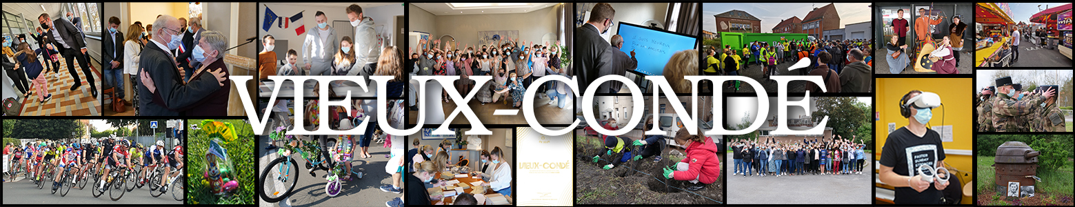
Notre site Ville de Vieux Conde utilise des cookies pour réaliser des statistiques de visites, partager des contenus sur les réseaux sociaux et améliorer votre expérience. En refusant les cookies, certains services seront amenés à ne pas fonctionner correctement. Nous conservons votre choix pendant 30 jours. Vous pouvez changer d'avis en cliquant sur le bouton 'Cookies' en bas à gauche de chaque page de notre site. En savoir plus
Paramétrages de cookies
×
Cookies fonctionnels
Ce site utilise des cookies pour assurer son bon fonctionnement et ne peuvent pas être désactivés de nos systèmes. Nous ne les utilisons pas à des fins publicitaires. Si ces cookies sont bloqués, certaines parties du site ne pourront pas fonctionner.
Mesure d'audience
Ce site utilise des cookies de mesure et d’analyse d’audience, tels que Google Analytics et Google Ads, afin d’évaluer et d’améliorer notre site internet.
Ce site utilise des composants tiers, tels que NotAllowedScript6943e445c496bReCAPTCHA, Google NotAllowedScript6943e445c2bdcMaps, MailChimp ou Calameo, qui peuvent déposer des cookies sur votre machine. Si vous décider de bloquer un composant, le contenu ne s’affichera pas
Des plug-ins de réseaux sociaux et de vidéos, qui exploitent des cookies, sont présents sur ce site web. Ils permettent d’améliorer la convivialité et la promotion du site grâce à différentes interactions sociales.